Color
correction is an essential aspect of Adobe photo editing service. It is the
process of adjusting the colors in an image to improve its overall appearance
and make it more visually appealing. Color correction can be used to fix
various issues such as color balance, color temperature, saturation, and
exposure. Here are
some of the color correction techniques that Adobe photo editing service
providers use:
1. Adjusting white balance: White balance is essential to ensure that the colors in the image appear natural and not overly warm or cool. Adjusting the white balance can help to fix color casts caused by different lighting conditions.
2. Adjusting exposure: Exposure refers to the amount of light that enters the camera and hits the image sensor. Adjusting the exposure can help to make an image brighter or darker, depending on the desired effect.
3. Adjusting contrast: Contrast refers to the difference between the lightest and darkest parts of an image. Adjusting the contrast can help to make an image more visually striking by enhancing its details.
4. Adjusting saturation: Saturation refers to the intensity of the colors in an image. Adjusting the saturation can help to make an image more vibrant or subdued, depending on the desired effect.
5. Adjusting hue: Hue refers to the color of an image. Adjusting the hue can help to shift the colors in an image to create a specific mood or to match a desired color scheme.
Adobe photo editing services also use various tools and techniques to make color correction more efficient and effective, such as color balance adjustments, selective color adjustments, and color grading. By using these techniques, they can help to enhance the visual impact of images and make them more appealing to customers.
Why need
Color match for image editing service?
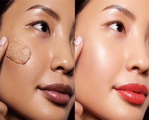
Color matching is crucial in image editing services because it helps to ensure that the colors in the final image are accurate and consistent. When images are captured, they may not always represent the true colors of the scene due to factors such as lighting, camera settings, and environmental conditions. Additionally, images may be captured using different devices or from different sources, which can result in variations in color accuracy.
Color matching is necessary to correct these issues and ensure that the final image accurately represents the colors of the original scene. It helps to create a cohesive look and feel for a set of images or for a brand by ensuring that the colors in all images match each other and that they accurately represent the brand's color scheme.
Color matching is also essential in various industries such as fashion, product photography, and e-commerce, where color accuracy is critical. For example, in product photography, it is essential to ensure that the colors of the product in the image match the actual product, as this can affect the customer's purchase decision.
In summary, color matching is necessary in image editing services to ensure that the final image accurately represents the original colors of the scene, creates a cohesive look and feel, and meets the requirements of various industries where color accuracy is critical.
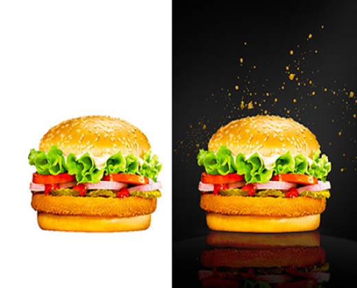
In today's digital age, product photography reigns supreme. It’s the virtual window to your brand, the first impression that entices customers to click "add to cart." But what separates captivating product photos from forgettable ones? The answer lies in the subtle art of color matching.
Color matching goes far beyond simply adjusting sliders in Photoshop. It's a symphony of science, artistry, and understanding your target audience. It’s about capturing the essence of a product, its true colors, and translating that onto the digital canvas in a way that evokes emotions, builds trust, and ultimately drives sales.
1.Introduction
In today's digital age, product photography reigns supreme. It’s the virtual window to your brand, the first impression that entices customers to click "add to cart." But what separates captivating product photos from forgettable ones? The answer lies in the subtle art of color matching.
Color matching goes far beyond simply adjusting sliders in Photoshop. It's a symphony of science, artistry, and understanding your target audience. It’s about capturing the essence of a product, its true colors, and translating that onto the digital canvas in a way that evokes emotions, builds trust, and ultimately drives sales.
This comprehensive guide delves into the world of color matching for product photography, empowering you to leverage the magic of Photoshop and create images that resonate with your customers. We’ll explore:
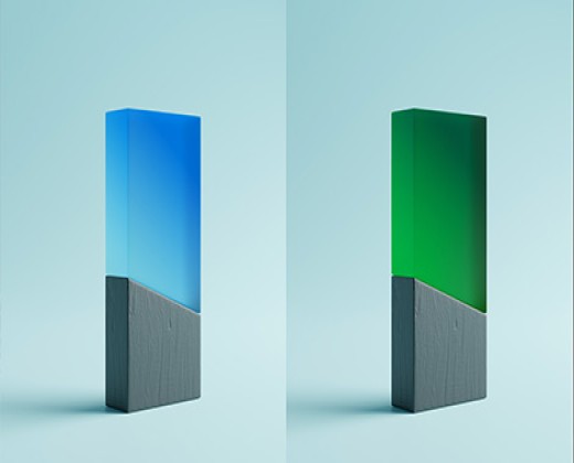
Understanding color theory is crucial for making informed decisions while editing product photos. The color wheel visually represents the relationships between colors, with primary colors (red, yellow, blue) forming the base, secondary colors (orange, green, purple) created by mixing primary colors, and tertiary colors formed by mixing primary and secondary colors. Colors have a "warmth" or "coolness" associated with them: warm colors like reds and oranges evoke energy and excitement, while cool colors like blues and greens create a sense of calmness and peace.
Colors significantly impact human emotions and behavior. Red evokes excitement, passion, and urgency. Blue signifies trust, calmness, and professionalism. Green represents growth, health, and tranquility. Yellow conveys happiness, energy, and attention. Purple suggests luxury, creativity, and sophistication.
Harmony refers to the pleasing arrangement of colors in your image. Techniques to achieve harmony include using complementary colors, which are opposing each other on the wheel and create vibrant looks; analogous colors, which sit next to each other and create serene designs; and triadic colors, which are three colors evenly spaced on the wheel and offer balanced schemes.
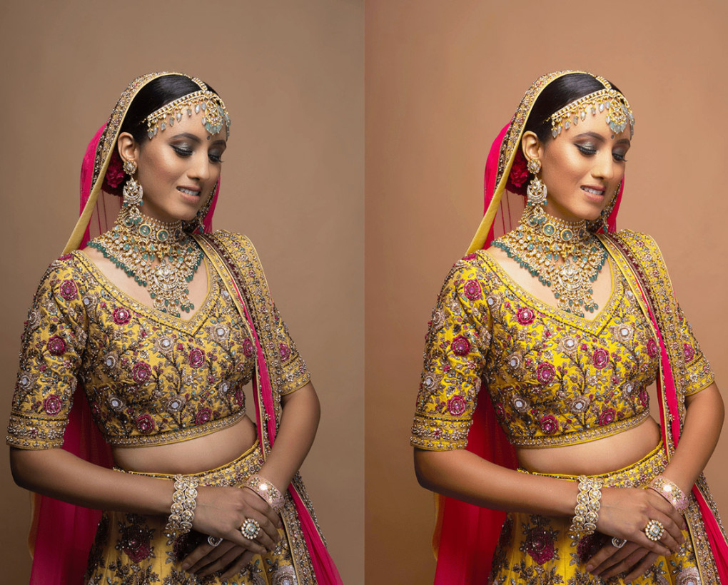
Levels allow you to adjust shadows, midtones, and highlights independently, which is crucial for correcting color casts and achieving a neutral color balance. Curves offer granular control over color correction by allowing you to target specific color channels and adjust them precisely for a refined look. Selective Color lets you fine-tune colors within specific ranges, making it useful for isolating objects or adjusting the color of specific elements within your photo. Hue/Saturation enables you to modify the hue (color itself), saturation (intensity of the color), and lightness, which is great for subtle adjustments or completely transforming a color.